Smartphones are annexing the watch around your wrist. Not only does your watch need to tell you the time and date, it must also show you who texted and called, who shared what on Facebook, and what’s happening on Twitter. The poor simple watch whose previous job was to get out of your way has been burdened with the need to be Smart.
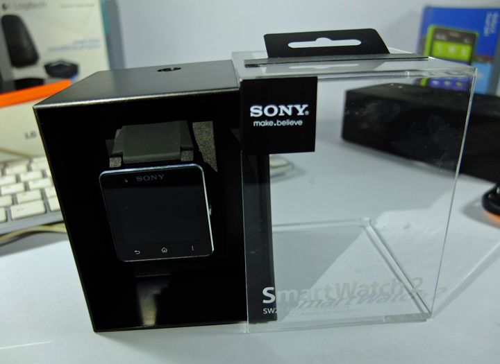
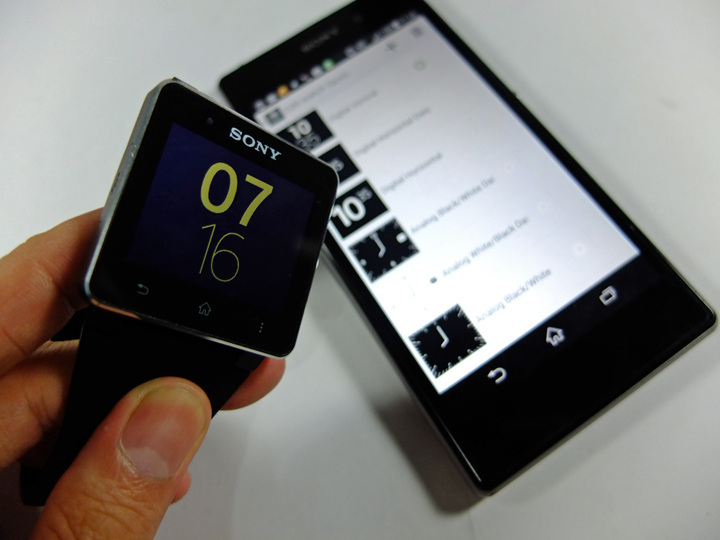
Sony is among many watch-annexers and their SmartWatch 2, which debuted last year is a posh but maybe a bit chunky, pixelated display strapped to your wrist that can pair with any Android device. When paired right, and the set up is clunky enough to discourage some people, you can get notifications from social media as well as text messages and calls. You can’t message back on the phone (there’s no keyboard and you can’t dictate back a la Dick Tracy) and you can’t take calls on it (you need the phone itself, in my case a Sony Xperia Z1, or a connected headset).
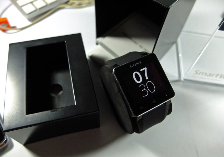
When you do get notifications, you can’t do much. You can’t mark emails as read, for example, and when notifications in Facebook or Twitter are late, it’s infuriating. Because you have to pull out your phone, which defeats the purpose. When the SmartWatch 2 takes its sweet time in responding to some taps, I simply pull out my phone and click next track. This reminds you that there are simply things in the world that are beyond your control. Anyway.
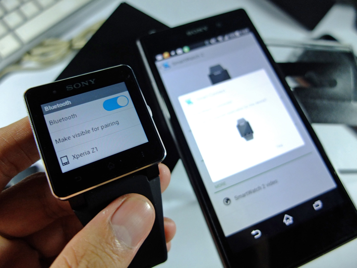
I paired the Sony SmartWatch 2 with the Sony Xperia Z1 via Bluetooth, though via NFC is also fine.
So without a paired-with Android, it’s just a watch, although waterproof and dust-proof – but don’t go diving in sea water – but the Sony SmartWatch 2 has the advantage of looking seriously fashionable (the Pebble watch seems like a toy) and the always on display is oh so elegant. But as a non-lover of squarish watches (unless they can transform into robots), I am too keenly aware of the SmartWatch 2 on my wrist, and what I’ve come to (not) expect from it.
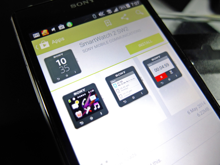
Yes. Download this app, and then download more apps for the SmartWatch to become more than a watch.
Quick Specs – The Sony SmartWatch 2
The SmartWatch 2 has a 1.6″ display with 220 x 176 resolution with three capacitive buttons at the watch’s chin. It’s got NFC for quick pairing (though I went the Bluetooth way), supports microUSB charging, and is IP57-certified making it SW2 dust and water resistant. The Sony SmartWatch 2 sells for around P7,000.00.
I imagine the problem Sony tried to solve is the one faced by commuters. Stuck in a train or a jam-packed bus or jeep, where it’s too cramped to pull out your phone, you still want to see who texted, what’s happening on social media, and who tried to call you. Of course if it’s really important you need to respond (you can’t on the SmartWatch 2) you still need your phone.
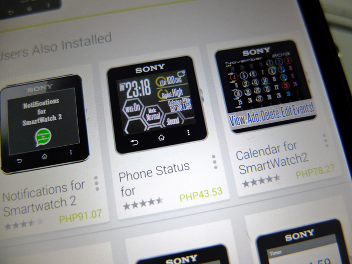
Some of the hi-tech-looking SmartWatch 2 apps are not free.
These scenarios are probably why some commuters attach their phones to lanyards worn around their necks with the phones in their breast pocket, for easy pull outs during the crammed commute.
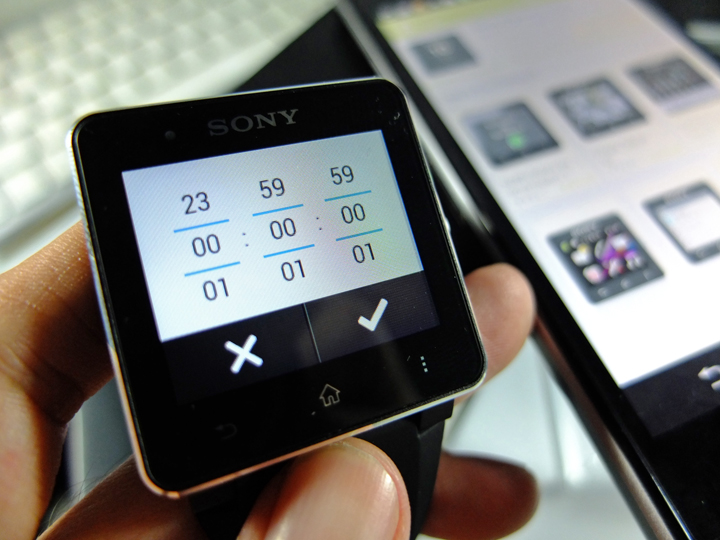
The sometimes sluggish UI on the tiny, pixelated screen of the SmartWatch 2 makes you feel like you’re giving the iPod Nano-looking watch to much to do. “I’m just a beautiful watch. Let me be!” It seems to say. There are people who love to let their smartwatches do their thing, who adore the things it can do, and overlook what they can’t. The SmartWatch 2 is a niche need.
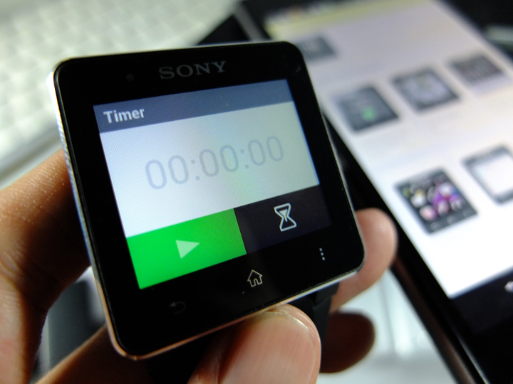
Some of us, while manufacturers were busy Android-annexing watches, simply got used to texting and Facebooking and tweeting in cramped rides, or while standing up and steadying ourselves in trains, sometimes doing these with one hand while the other clutches our bags.
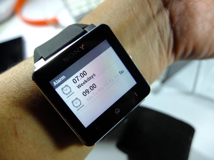
But then we’re simply talking about the form factor (clunky blocky watch as awkward notification center on your wrist), which other manufacturers are now trying to solve in the form of a fitness tracking wristband with rectangular display where readable text moves.
The SmartWatch 2 is an improved sequel to its predecessor, but hey, maybe it’s just me.
Good
Sony design language miniaturized for wristwatch size.
Elegant looks, comfy strap.
If you’re just passively reading notifications, it’s fine.
As a stand alone watch, it looks good.
Bad
Clunky interface, tricky to set up.
Can be sluggish, to the point that you’ll pull out your phone.
Slightly bulky, making me wish it could do something else, like transform into a robot.
Pixelated display – paired with a beautiful Sony Xperia Z1, the SmartWatch 2 just looks “undermined”.
If you’re pro active when checking out notifications, you might as well do it on your phone.
—
You may also wish to see our is-it-still-good review of the Sony Xperia Z1.
Liked this post? Follow SwirlingOverCoffee on Facebook, YouTube, and Instagram.

