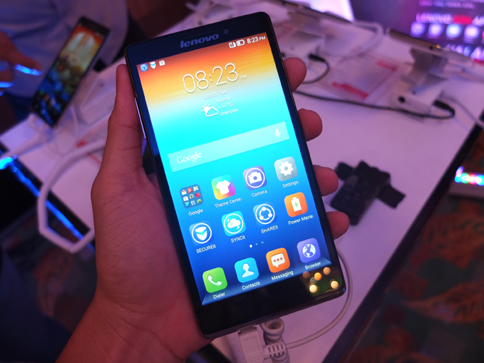
I think I’m going to love this phone – and the last time I said that was of the LG G2, about which I was right. The feel of the Lenovo Vibe Z in my hand, the svelte, fluid and thoughtful UI; and the fact that, despite the 5.5″ display, it’s not overly wide. By contrast, the Sony Xperia Z1 always did feel awkward in my hand, with its cold metal frame and wide girth, but not the Vibe Z.
- Lenovo Vibe Z Specs Sheet - Click to View
-
5.5″ Full HD IPS display, 1080×1920 pixels, 401ppi
Corning Gorilla Glass 3, Android 4.3 Jellybean
Qualcomm Snapdragon 800 2.2GHz quad-core processor
Adreno 330 Graphics, 2GB RAM
16GB internal storage, no microSD expansion slot
HSPA+, LTE 150Mbps, WiFi 802.11 a/b/g/n/ac, dual band
Bluetooth 4.0, GPS with aGPS support, GLONASS, FM Radio
Sony IMX135 13MP f/1.8 rear camera with dual LED flash
5MP 84 degree wide angle front camera
Li-Po 3000mAh battery, 149.1 x 77 x 7.9mm, 142g
Comes in Silver and TitaniumSRP Php 24,990.00
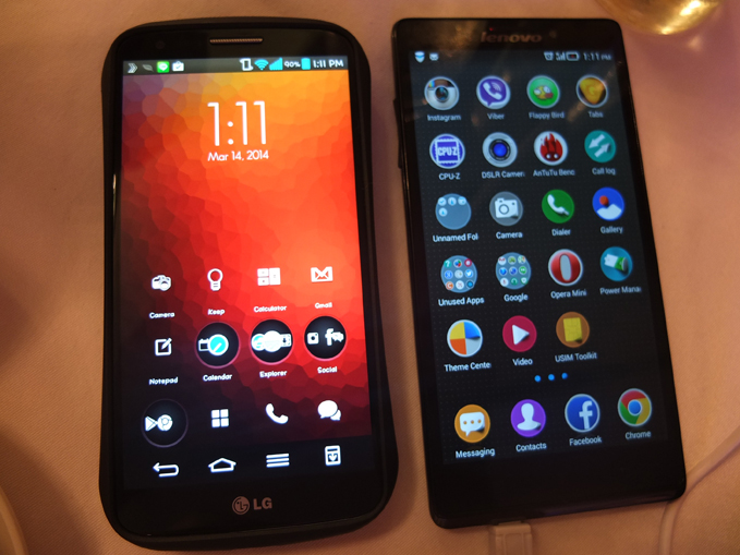
Above: The Inevitable comparison. The LG G2 on the left (5.2″ display) and the Lenovo Vibe Z on the right (5.5″ display).
Here are my first impressions of Lenovo’s first LTE phone.
The Good
Good price. Open Communications, Lenovo’s partner distributor, is selling the Vibe Z for P25,000.00, which is just a tad higher than how the LG G2 32GB is sold on the gray market (P21,200.00). But keep in mind you’re getting a massive screen (for video marathons), a wide-angle front camera (for awesome group selfies), and a possibly impressive battery life (read next item below). The Vibe Z is a phablet that may not feel like an awkward phabelt. Also, imagine how much gets slashed from that P25k SRP once the Vibe Z hits the gray market. (Insert happy thoughts here.)
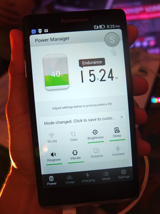
Potentially long battery life, longer than that of the LG G2 and Samsung Galaxy Note 3. Intel’s low power consumption chip is the heart of the Lenovo Vibe Z – tandem that with the massive 3,000 mAh battery of the Z and you probably have (I’ll wait for the review unit to test this) a stamina matching that of the LG G2, or possibly exceeding it.
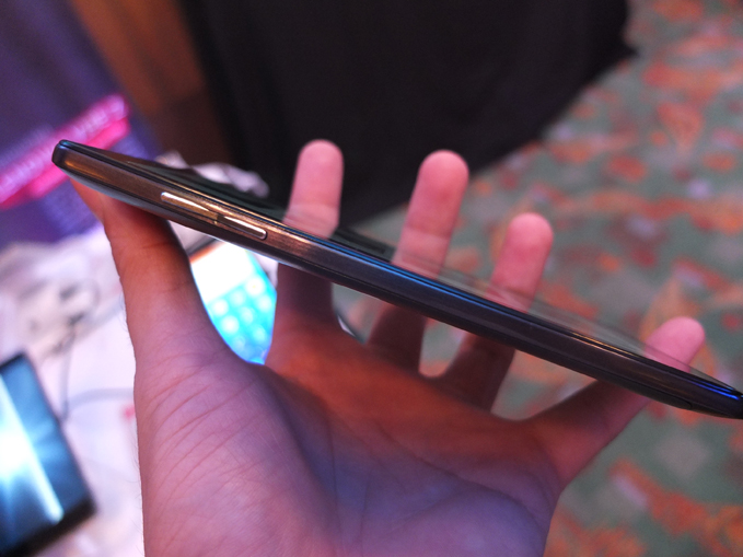
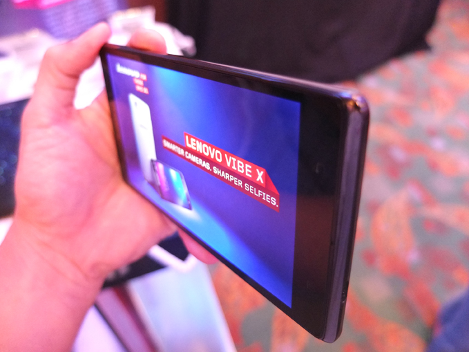
Design decisions concerning the display size AND the body housing it are brilliant – at least to me. The Lenovo Vibe Z seems to mimic the thin and square edged design of the Sony Xperia Z1, but without the cold steel feel and unpleasant sharpness, and without the uncomfortable wideness that overstretches your hand. My brain still can’t process how this is 5.5 inches and yet my hand did not in the least complain. Of course when I calmed down, it was obvious that the 5.5 inches was achieved by lengthening the display and not widening it, while making sure the phone’s forehead, chin, and side bezels were kept to a minimum. Bravo, Lenovo.
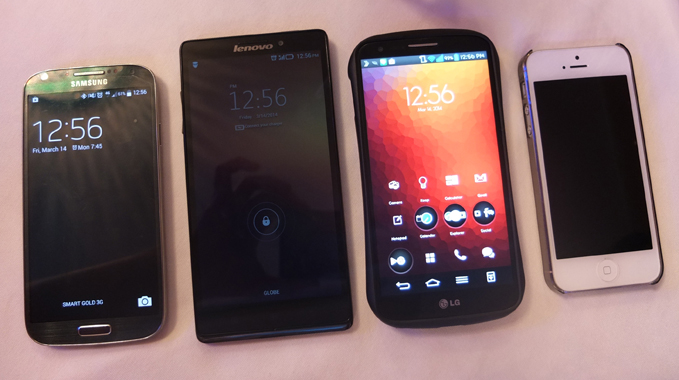
Above: Size of the four. From left to right: the Samsung Galaxy S4, the Lenovo Vibe Z, the LG G2, and the iPhone 5. Thanks be to Ren Alcantara of Gadgets Magazine and Tomas Noda for lending me an S4 and an iPhone for this shot.
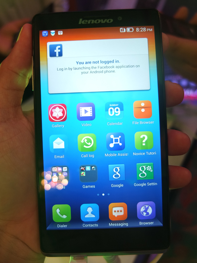
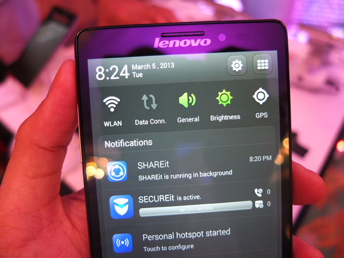
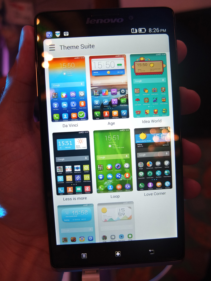
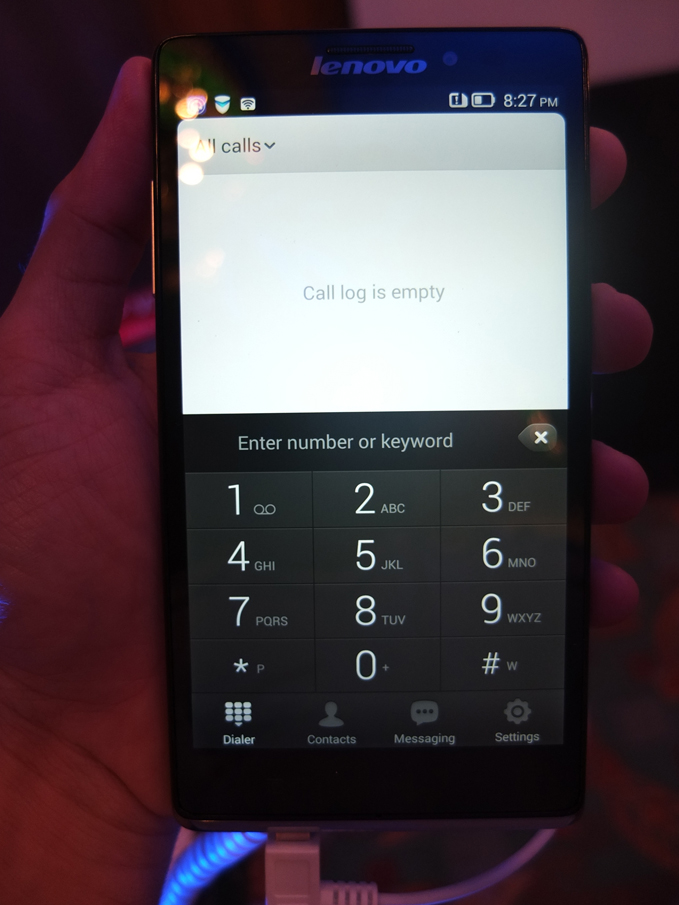
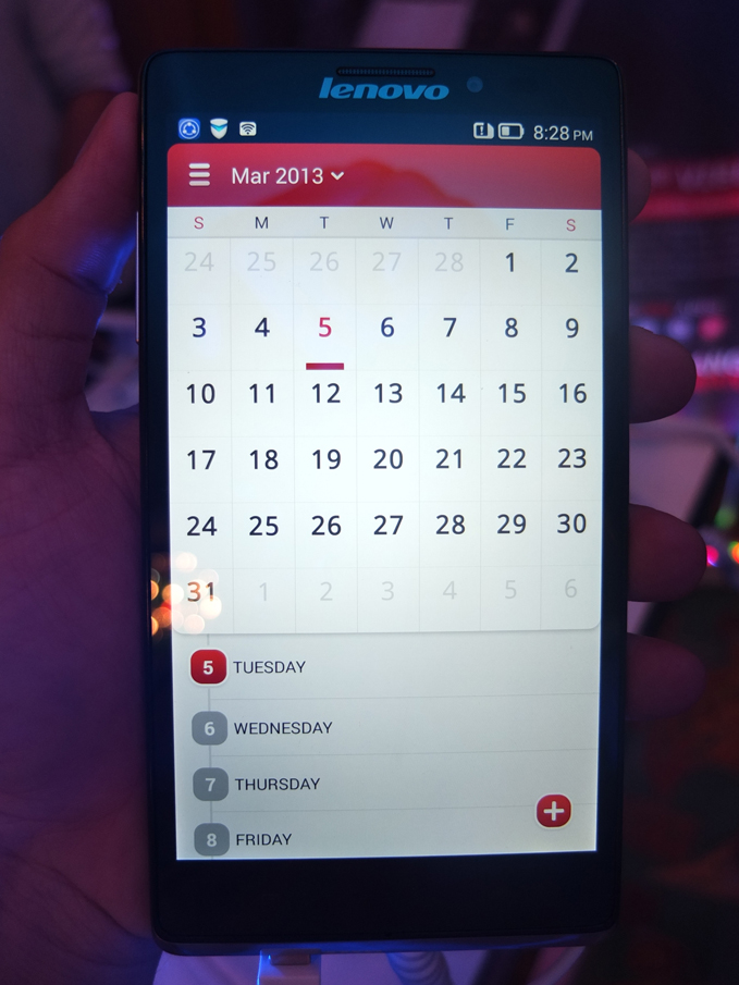
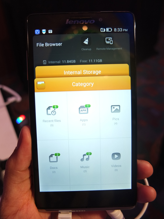
Wonderfully designed UI. At the launch, while documenting screen loading and app behavior, I often use my left hand to hold the phone and my right to take shots. But with the Vibe Z, I wanted to put the camera down and just play with the Vibe Z. Several times I failed to take shots because I was mesmerized by the UI. At that moment I forgot my lust for both the HTC Sense 5 and Sony Xperia design language. Also, one of several faults of the LG G2, besides the plasticky body, is the thoughtless UI, which is just screaming to be overlaid with a launcher. Not the Vibe Z. It haZ its own, shall we say, Vibe?
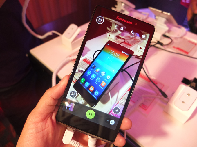
5MP wide angle front camera. The thing about having a clear, crisp, sharp display and a wide angle camera is that group selfies are better. There’s no problem framing that shot, an act that’s instantly gratifying, given the quality of the images I’ve seen. I reckon the Vibe Z’s front camera may even surpass my often-recommended selfie phone, the Huawei Ascend P6. If you’re going on vacation and are thinking of getting a camera with an flexible screen (for selfies), maybe, with the Vibe Z, you don’t need to.
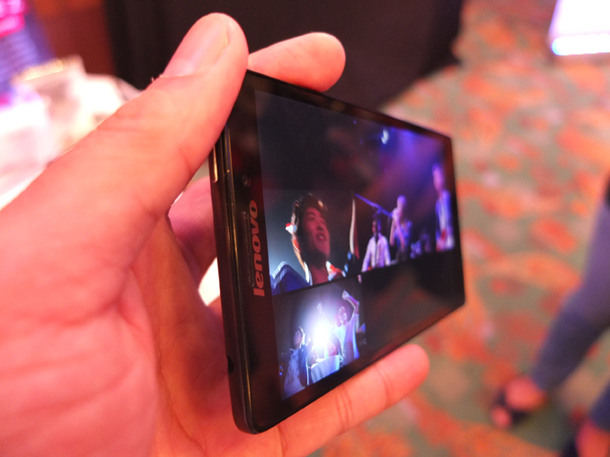
Above: Great viewing angles, check!
SECUREit combines malware and spam protection, data security from thieves, encryption for private calls and contacts, and cache clean up for smoother device performance.
SECUREit is one of the five Lenovo Do It Apps, which come bundled with the Vibe Z. According to Lenovo, “In case of loss or theft, anti-theft protection locks down the device in case someone tries to change the SIM card, which makes the device unusable without a password.”
As much as I’d love to see what “unusable without a password” means, I’m intrigued by this encryption for private calls and contacts feature. Could this be the phone three-timers and corporate spies are waiting for?
Above: The Lenovo Vibe Z UI is snappy, fluid, and makes sense.
Possibly Bad
No microSD card slot, so you’re stuck with the 12GB user-allotted storage. Or maybe not. We now live in a time when USB flash drives as thin as your pinkie finger can hold 16GB of storage and not require a USB OTG to connect with your computer. That way, you can still bring with you your see and see again movies without clogging the internal storage of the Lenovo Vibe Z.
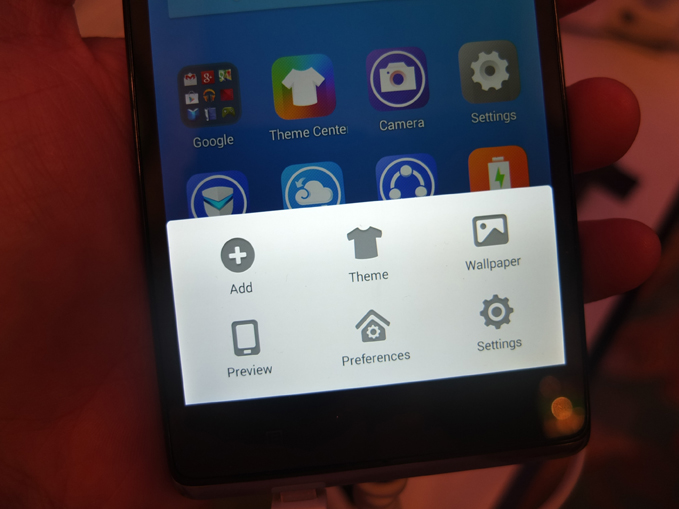
Here are more shots of the Lenovo Vibe Z’s UI that I adore.
So then…
I’m waiting for my review unit. As I’ve extensively reviewed the LG G2, I’m excited to subject the Lenovo Vibe Z to the same treatment.
Liked this post? Follow SwirlingOverCoffee on Facebook, YouTube, and Instagram.


